I recently went down a bit of an educational rabbit 🐇 hole with ggplot is setting axis limits. So I thought I would share some insights I gathered along the way.
ylim
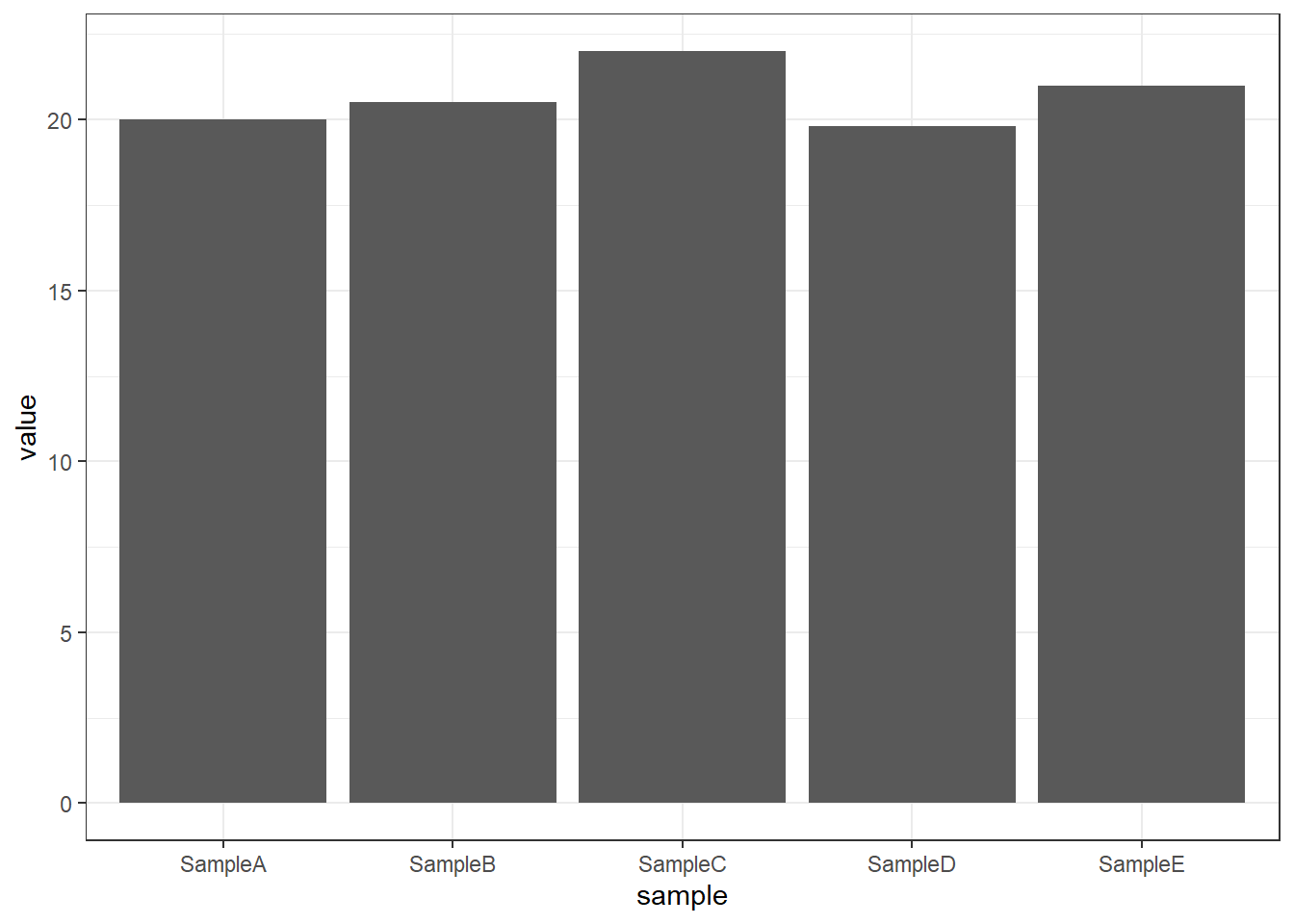
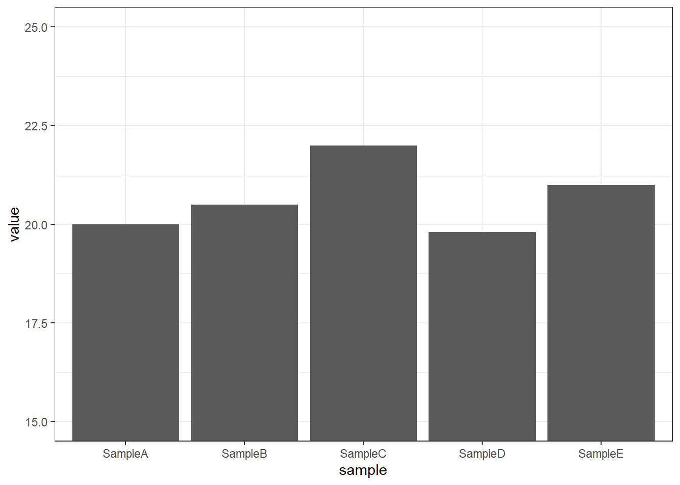
It all started with a simple barplot 📊 using ggplot2. Typically, I prefer to filterthe data before plotting, avoiding axis limits. However, on this occasion, I wanted to focus in on the differences between values that were relatively small compared to the overall bars. Queue example data 👇
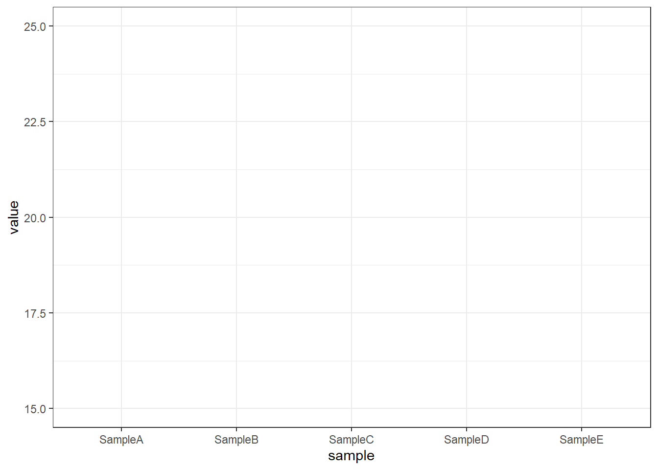
And boom! 💥 Everything disappeared. Initially, I was puzzled 🤔 Where did my bars go? After some digging, I realised that ylim() was not the function I was looking for.
The ylim() function removes 🧹 any data outside the specified range. Since I chose a barplot, the bars extend from 0 on the y-axis to the sample value, resulting in them being removed. If I had used geom_point, everything would have been fine:
Using coord_cartesian, all the underlying data is retained, but the plot is zoomed in as if using a magnifying glass. 🔍 ✅
Now, you might think this is only relevant for bar plots. However, let’s explore why it’s important even for scatter plots with geom_point.
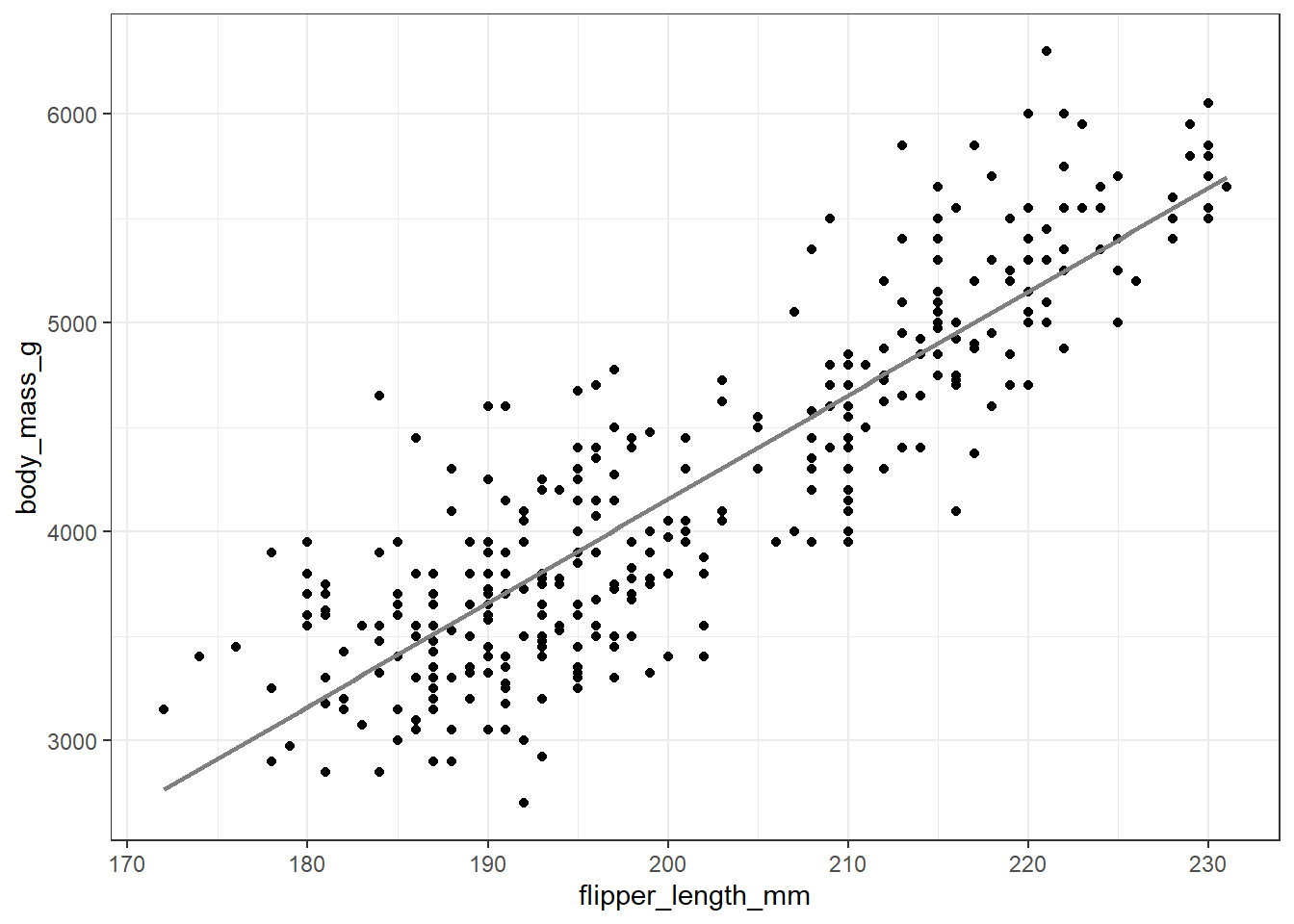
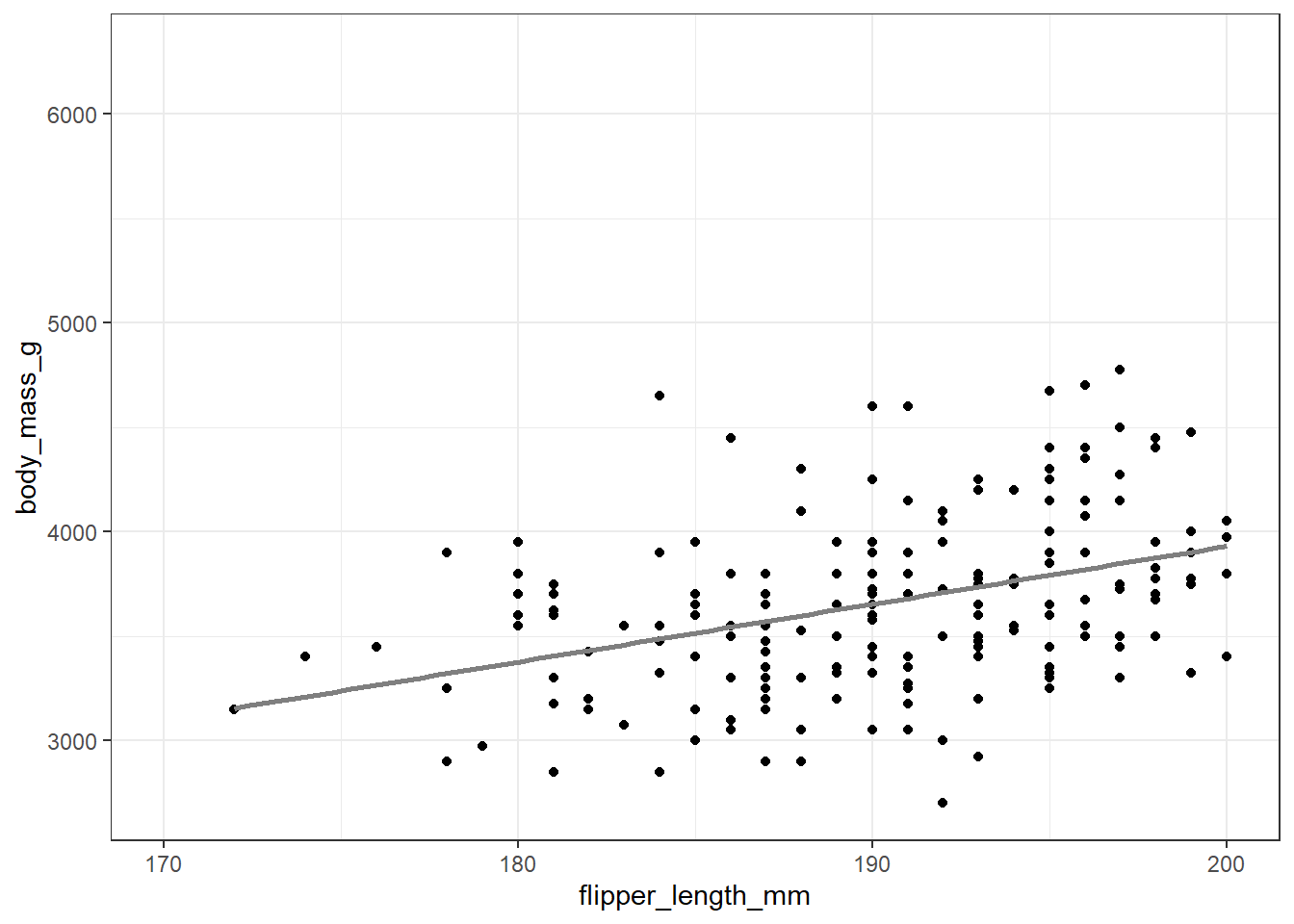
Consider data with a strong linear correlation. What happens when we limit the x-axis? Instead of just showing a zoomed-in focus, the linear regression is recalculated with only the data in view, resulting in a misleading correlation:
library(palmerpenguins)data(penguins)ggplot(data = penguins, aes(x = flipper_length_mm, y = body_mass_g)) +geom_point() +geom_smooth(method ="lm", se =FALSE, color ="gray50") +theme_bw()
`geom_smooth()` using formula = 'y ~ x'
ggplot(data = penguins, aes(x = flipper_length_mm, y = body_mass_g)) +geom_point() +geom_smooth(method ="lm", se =FALSE, color ="gray50") +theme_bw() +xlim(170, 200)
`geom_smooth()` using formula = 'y ~ x'
You can see that depending on the context this approach could be problematic.
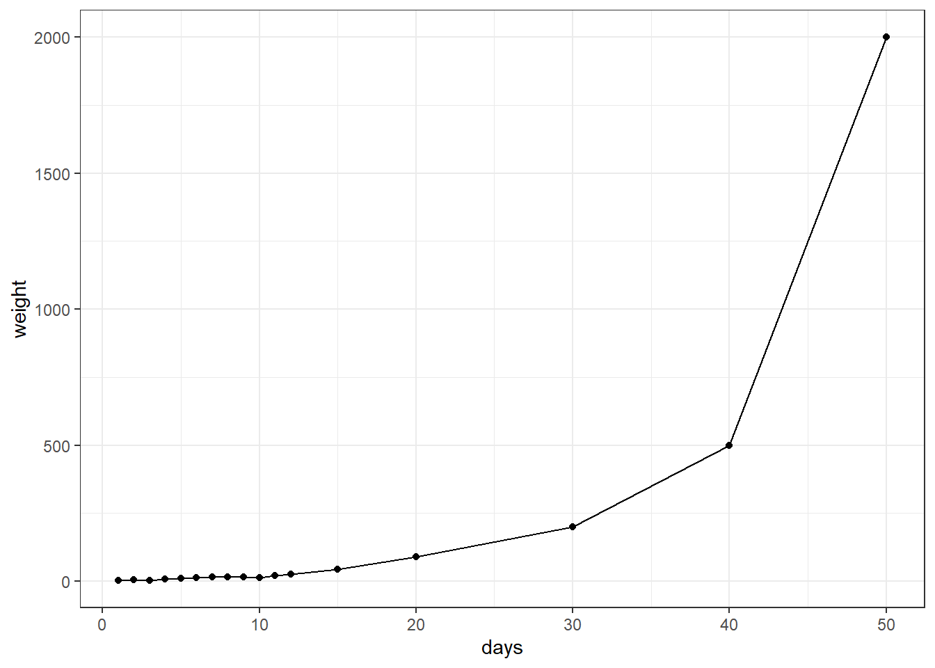
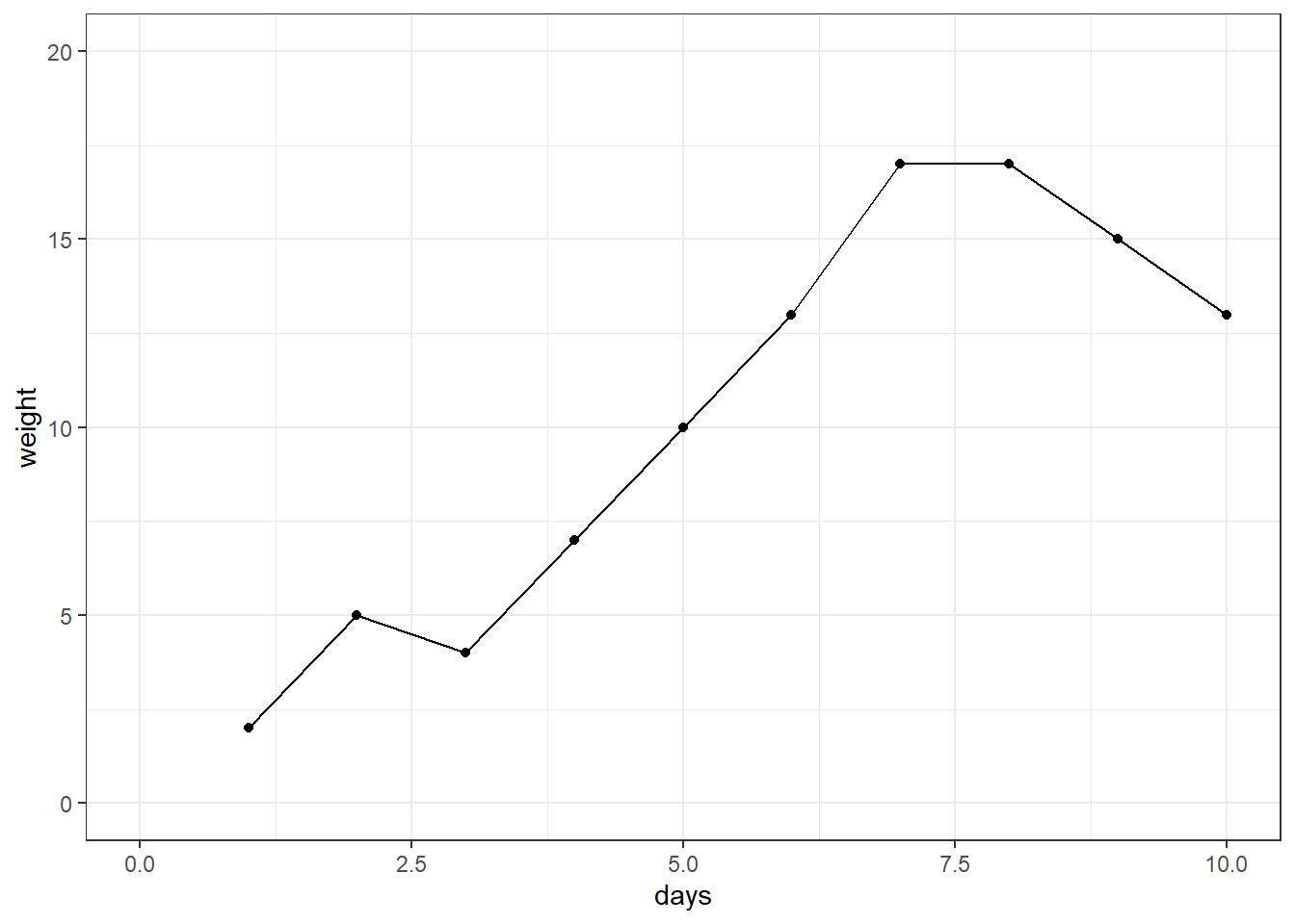
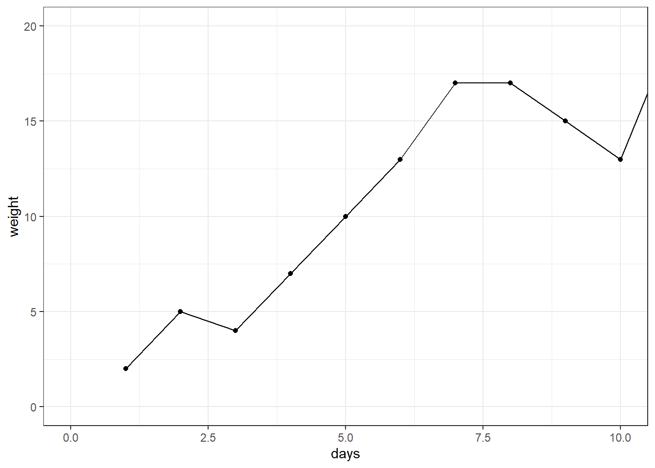
Or, let’s say you’re inspecting time series data, such as growth over time:
And you wanted to focus in on early growth. If you used xlim() instead of coor_cartesian(), you will notice below that the last piece of informative data, that the growth recovers and continues to increase, is lost.
While most statistics are computed before plotting, and therefore this may not drastically change data interpretation, using coord_cartesian() ensures you’re zooming in rather than trimming data.
scales
📢 Shoutout to June Choe for highlighting this, even coord_cartesian() might not be the function you want.
Instead, consider defining your x or y limits within the scale_*() functions and using the scales package to handle out-of-bounds (OOB) values. This approach makes your logic clearer to others using your code, or even to yourself when revisiting your script months later. June has a video explaining this a little more 🎥
Let’s revisit our barplot example. By specifying the y-axis limits to be between 15 and 25 and using scales::oob_keep(), we maintain values outside these limits for the background dataset and other statistical calculations. This effectively zooms into the data within our specified limits without removing out-of-bounds values.
Maybe you have already been through this journey and are an axis limiting champion. Hopefully though this post helps someone. If you have any suggestions or additions, please share them!