library(tidyverse)
data(mtcars)

base_plot <- ggplot(mtcars, aes(hp, mpg)) +
  geom_point(size = 4, alpha = 0.6, colour = "#22333b") +
  geom_smooth(size = 1.5, se = F, colour = "#3a86ff") +
  labs(title = "Example of a plot **embedded** within another",
    subtitle = "Using the function *'annotation_custom()'*") +
  theme_bw() +
xlim(50, 200)R
R
A worthy collection of short R commands and tricks

A worthy collection of short R commands and tricks. 👍 As featured in R Weekly 2023-W44
Using {custom_annotation} to embed one plots inside another.
Embedded plots can be a powerful tool for showcasing data across an extended axis while still emphasizing specific sections.
Creating these are very easy. Here is a quick guide and example:
Step 1: Create your base plot.
Begin by establishing your base plot, which will serve as the canvas for your embedded plot. Typically, the base plot is the primary focus of your visualization.
Step 2: Create your plot that you want to embed within the canvas.
Your embedded plot doesn’t have to be the same type as your base plot. Feel free to customize it according to your data visualization needs.
embedded_plot <- ggplot(mtcars, aes(hp, mpg)) +
  geom_point(size = 4, alpha = 0.6, colour = "#22333b") +
  geom_smooth(size = 1.5, se = F, colour = "#3a86ff") +
  theme_bw()
Step 3: Use custom_annotate() to embed the plot.
Now, it’s time to embed the plot within the canvas using the annotation_custom() function. You’ll need to specify the X and Y positions for the embedded plot:
base_plot + annotation_custom(ggplotGrob(embedded_plot),
                              xmin = 125,
                              xmax = 200,
                              ymin = 22,
                              ymax = 35)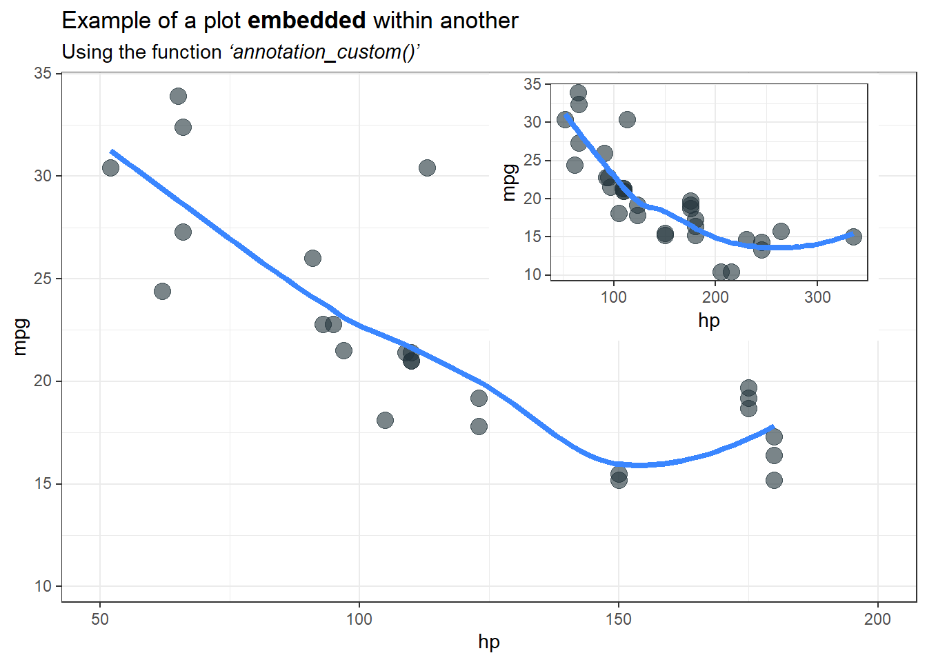
Adding linking colours to plot titles instead of a legend
Enhancing your plot titles with linking colours 🌈 is a clever strategy to maximise your plot realestate by eliminating legends, all while looking fantastic!

To achieve this style you will need:
the {ggtext} package which will perform the HTML rendering, in this case in the subtitle to define the text colour.
Adding
plot.subtitle = element_markdown()to the theme, {ggtext} will perform markdown rendering, for example making specific text bold, or in the above example, italicised.and finally, adding
legend.position = "none"also to the theme will remove the old clunky default legend
Here is the full code 👇 enjoy!
library(ggplot2) # For plotting
library(palmerpenguins) # For the example penguin dataset
library(ggtext) # For HTML rendering of text to support colour
                # Also for Markdown rendering of text

ggplot(data = penguins,
       aes(x = flipper_length_mm,
           y = body_mass_g)) +
  geom_point(aes(color = species,
                 shape = species),
                 size = 2) +
  scale_color_manual(values = c("#FF8C00","#9932CC","#008B8B")) +
  labs(title = "Penguin flipper length versus body mass",
       subtitle = "Penguin species
       <span style='color:#FF8C00;'>*Pygoscelis adeliae*</span>,
       <span style='color:#9932CC;'>*Pygoscelis papua*</span> and
       <span style='color:#008B8B;'>*Pygoscelis antarcticus*</span>",
       x = "Flipper Length (mm)",
       y = "Body Mass (g)")  +
  theme_minimal() +
  theme(panel.grid = element_blank(),
        plot.subtitle = element_markdown(),
        legend.position = "none")
If you want to go a step further you can add the corresponding point shape/symbol to the subtitle as well🎉

All you need to do is add the HTML Unicode (e.g. ● for ●) for the matching symbol/shape to the subtitle. You can look up the HTML Unicode here.
Note
For some reason when viewing the plot in the Rstudio plot tab, additional spaces (relative to the length of the Unicode) will appear next to the symbols. However, this disappears when you render the image in a quarto document or save the plot as an image.

Here is the full code 👇 enjoy!
library(ggplot2) # For plotting
library(palmerpenguins) # For the example penguin dataset
library(ggtext) # For HTML rendering of text to support colour
# Also for Markdown rendering of text
# Get HTML code for genometric symbols from:
# https://www.htmlsymbols.xyz/geometric-symbols
ggplot(data = penguins,
aes(x = flipper_length_mm,
y = body_mass_g)) +
geom_point(aes(color = species,
shape = species),
size = 2) +
scale_color_manual(values = c("#FF8C00","#9932CC","#008B8B")) +
labs(title = "Penguin flipper length versus body mass",
subtitle = "Penguin species
<span style='color:#FF8C00;'>*Pygoscelis adeliae* ●</span>,
<span style='color:#9932CC;'>*Pygoscelis papua* ⯅</span> and
<span style='color:#008B8B;'>*Pygoscelis antarcticus* ⯀</span>",
x = "Flipper Length (mm)",
y = "Body Mass (g)") +
theme_minimal() +
theme(panel.grid = element_blank(),
plot.subtitle = element_markdown(),
legend.position = "none")Transform axis numbers into more readable formats
Want to avoid number labels on your plots that are difficult to read or interpret such as the all too common scientific e notation as seen in this example? 👇

The cut_short_scale() function from the {scales} package will conveniently convert your unclear labels to a more appropriate format. Lets apply it to our example from above. 🥳🎉
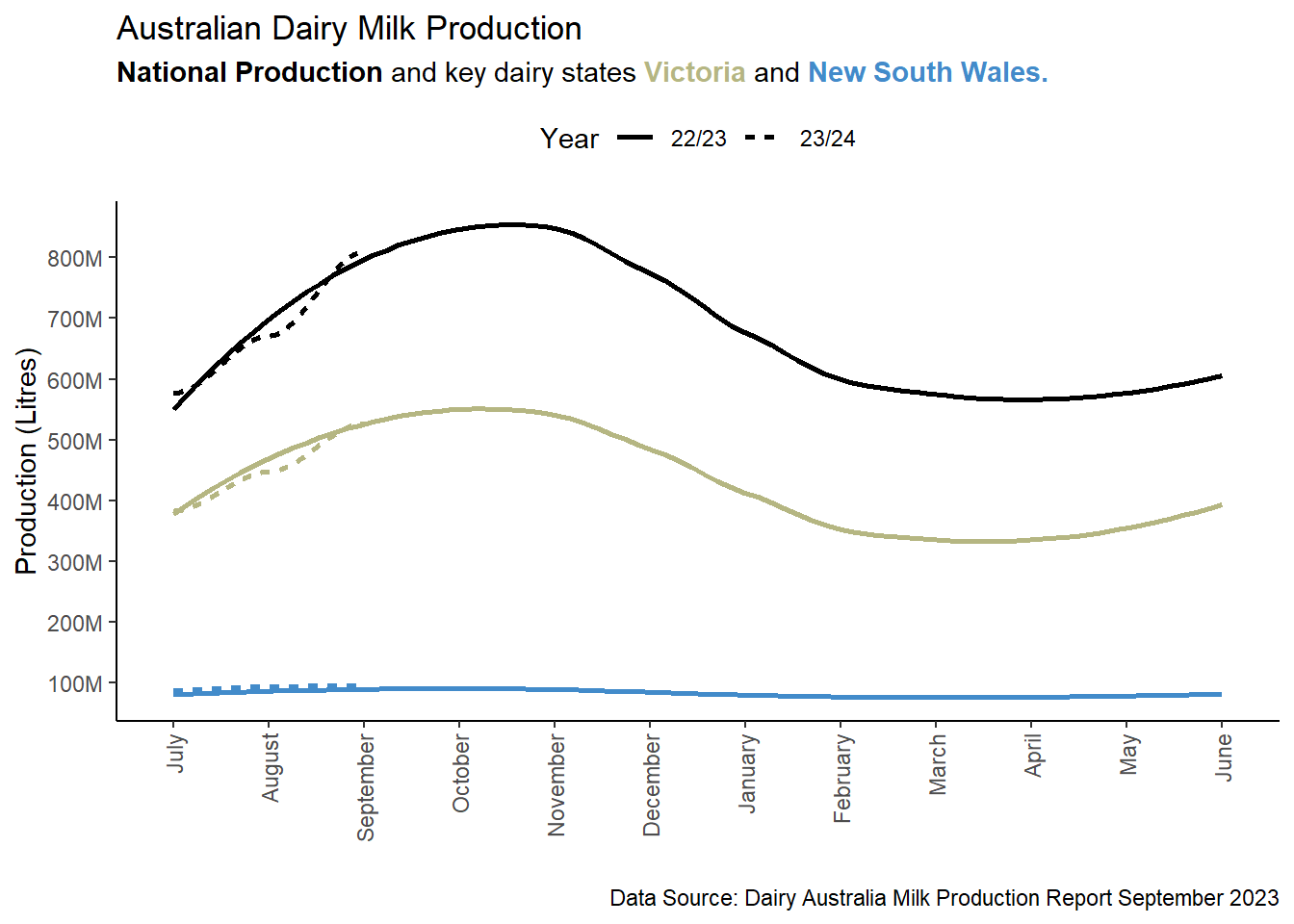
Here is the full code 👇 enjoy!
library(ggplot2) # For plotting
library(ggtext) # For HTML rendering of text to support colour
                # Also for Markdown rendering of text
library(scales)

data2 <- tibble::tribble(
             ~Month,   ~Year,     ~Region, ~Production_Litres,
             "July", "22/23",       "NSW",        80742825.35,
           "August", "22/23",       "NSW",        85515267.53,
        "September", "22/23",       "NSW",        89642883.77,
          "October", "22/23",       "NSW",        92774430.63,
         "November", "22/23",       "NSW",         86431638.4,
         "December", "22/23",       "NSW",        86230113.71,
          "January", "22/23",       "NSW",        81030159.32,
         "February", "22/23",       "NSW",        72891273.03,
            "March", "22/23",       "NSW",        78366274.94,
            "April", "22/23",       "NSW",         75805741.9,
              "May", "22/23",       "NSW",        79986532.53,
             "June", "22/23",       "NSW",        80446060.32,
             "July", "22/23",       "VIC",       386373862.86,
           "August", "22/23",       "VIC",        450615318.9,
        "September", "22/23",       "VIC",       527734837.67,
          "October", "22/23",       "VIC",        575715726.1,
         "November", "22/23",       "VIC",       519338047.94,
         "December", "22/23",       "VIC",       499009041.08,
          "January", "22/23",       "VIC",       423251928.39,
         "February", "22/23",       "VIC",       323689836.55,
            "March", "22/23",       "VIC",        333750042.9,
            "April", "22/23",       "VIC",       340058086.75,
              "May", "22/23",       "VIC",        388157951.5,
             "June", "22/23",       "VIC",       373346197.82,
             "July", "22/23", "Australia",        570199372.1,
           "August", "22/23", "Australia",       659242110.71,
        "September", "22/23", "Australia",       797167795.77,
          "October", "22/23", "Australia",       888535142.24,
         "November", "22/23", "Australia",        818914946.8,
         "December", "22/23", "Australia",       790237598.05,
          "January", "22/23", "Australia",       693408820.19,
         "February", "22/23", "Australia",       553467890.76,
            "March", "22/23", "Australia",       580325765.96,
            "April", "22/23", "Australia",       577153026.75,
              "May", "22/23", "Australia",       623257518.13,
             "June", "22/23", "Australia",       576627597.06,
             "July", "23/24",       "NSW",        87662230.03,
           "August", "23/24",       "NSW",        93724243.26,
        "September", "23/24",       "NSW",        96012475.27,
             "July", "23/24",       "VIC",       382943134.47,
           "August", "23/24",       "VIC",       447394128.72,
        "September", "23/24",       "VIC",       526453329.78,
             "July", "23/24", "Australia",       576952581.71,
           "August", "23/24", "Australia",       670893737.51,
        "September", "23/24", "Australia",       809301895.87
        )
data <- data |> mutate(Month = factor(Month, levels = c("July", "August", "September", "October", "November", "December", "January", "February", "March", "April", "May", "June")))


ggplot(data = data, aes(x = Month, y = Production_Litres, colour = Region, linetype = Year, group = interaction(Region, Year))) +
  geom_smooth(se=FALSE) +
  scale_color_manual(values = c("#000000","#428bca","#b5b682")) +
  scale_y_continuous(labels = scales::label_number_si()) +
  labs(title = "Australian Dairy Milk Production",
       subtitle = "<span style='color:#000000;'>**National Production**</span> and key dairy states
         <span style='color:#b5b682;'>**Victoria**</span> and
         <span style='color:#428bca;'>**New South Wales.**</span>",
       x = "",
       y = "Production (Litres)",
       caption = "Data Source: Dairy Australia Milk Production Report September 2023")  +
  theme_classic() +
  theme(panel.grid = element_blank(),
        plot.subtitle = element_markdown(),
        legend.position = "top") +
  theme(axis.text.x = element_text(angle = 90, vjust = 0.5, hjust=1)) +
  guides(colour = "none", linetype = guide_legend(override.aes = list(color = "#000000")))
Elegantly Join 3+ tibbles using a common key
Joining two tibbles is simple and concise using the join commands from dplyr. However, when you have three or more tibbles to join, you will often find yourself either writing a long pipe or taking a stepwise approach of joining the first two into a new object and using that to join with the third tibble, and so on.
Nevertheless, you can avoid all this by combining the reduce function from the 🐈⬛ purrr package with the relevant join command. Below is a simple example. 👇
library(dplyr)
library(purrr)

dt1 <- tibble(character = c("Harry", "Hermione", "Draco"),
              house = c("Gryffindor", "Gryffindor", "Slytherin"))

dt2 <- tibble(character = c("Harry", "Hermione", "Draco"),
              wand = c("Holly-phonenix-feather", "Vine-dragon-heartstring", "Hawthorn-unicorn-hair"))

dt3 <- tibble(character = c("Harry", "Hermione", "Draco"),
              gender = c("Male", "Female", "Male"))

reduce(list(dt1, dt2, dt3), left_join, by = 'character')
# A tibble: 3 × 4
character house wand gender
<chr> <chr> <chr> <chr>
1 Harry Gryffindor Holly-phonenix-feather Male
2 Hermione Gryffindor Vine-dragon-heartstring Female
3 Draco Slytherin Hawthorn-unicorn-hair Male Add a prefix to column names when pivoting from long-data to wide-data
At times, you may find it necessary to apply a prefix to the column names created when transitioning from long-format data to wide-format data. The good news is that the pivot_wider() function streamlines this process by offering the names_prefix argument. This feature proves particularly valuable when working with multiple tibbles that share similar naming conventions and structures. After all, nobody enjoys dealing with default conflict resultion of identical column names like colname1.x, colname1.y, colname2.x, colname2.y, and so on.
library(tidyr)
library(tibble)

weather <- tribble(
                 ~Date, ~Measurement, ~Value,
             20100101L,   "T.Max_oC",   31.2,
             20100102L,   "T.Max_oC",   31.7,
             20100103L,   "T.Max_oC",   32.5,
             20100104L,   "T.Max_oC",   28.9,
             20100101L,   "T.Min_oC",   21.3,
             20100102L,   "T.Min_oC",   21.5,
             20100103L,   "T.Min_oC",   22.2,
             20100104L,   "T.Min_oC",   22.1,
             20100101L,    "Rain_mm",    0.6,
             20100102L,    "Rain_mm",    0.4,
             20100103L,    "Rain_mm",    0.8,
             20100104L,    "Rain_mm",    6.8,
             20100101L,    "Evap_mm",    4.1,
             20100102L,    "Evap_mm",    4.6,
             20100103L,    "Evap_mm",    5.9,
             20100104L,    "Evap_mm",    4.4
             )
weather
# A tibble: 16 × 3
Date Measurement Value
<int> <chr> <dbl>
1 20100101 T.Max_oC 31.2
2 20100102 T.Max_oC 31.7
3 20100103 T.Max_oC 32.5
4 20100104 T.Max_oC 28.9
5 20100101 T.Min_oC 21.3
6 20100102 T.Min_oC 21.5
7 20100103 T.Min_oC 22.2
8 20100104 T.Min_oC 22.1
9 20100101 Rain_mm 0.6
10 20100102 Rain_mm 0.4
11 20100103 Rain_mm 0.8
12 20100104 Rain_mm 6.8
13 20100101 Evap_mm 4.1
14 20100102 Evap_mm 4.6
15 20100103 Evap_mm 5.9
16 20100104 Evap_mm 4.4weather |>
pivot_wider(names_from = Measurement,
names_prefix = "UQGatton_",
values_from = Value)# A tibble: 4 × 5
Date UQGatton_T.Max_oC UQGatton_T.Min_oC UQGatton_Rain_mm UQGatton_Evap_mm
<int> <dbl> <dbl> <dbl> <dbl>
1 20100101 31.2 21.3 0.6 4.1
2 20100102 31.7 21.5 0.4 4.6
3 20100103 32.5 22.2 0.8 5.9
4 20100104 28.9 22.1 6.8 4.4Initalise an empty tibble with predined column names
Before diving into a loop of calculations, it’s often beneficial to initialise an empty tibble to seamlessly store results from each iteration. Instead of manually specifying column names, you can streamline the process by leveraging the power of the map_dfc() command in {purrr} 🐈 Simply pass a vector of column names to tibble, and watch your data structure effortlessly take shape.
vec_colnames <- c("Wizard", "House", "Wand")

empty_tibble <- vec_colnames |>
  purrr::map_dfc(setNames, object = list(character()))

empty_tibble
# A tibble: 0 × 3
# ℹ 3 variables: Wizard <chr>, House <chr>, Wand <chr>map_dfc() has now been superseded 🏗 by map() and I have also updated the code to be more explicate and inline with {purrr} recommendations. Thanks Jim Gardner for the suggestions and edits.
vec_colnames <- c("Wizard", "House", "Wand")

empty_tibble <- vec_colnames |>
  purrr::map(\(x) setNames(object = tibble::tibble(character()), nm = x)) |>
  purrr::list_cbind()

empty_tibble
# A tibble: 0 × 3
# ℹ 3 variables: Wizard <chr>, House <chr>, Wand <chr>Highlight points of interest with annotations
Utilising arrow and text annotations can significantly elevate the impact of your visualisations by directing attention to crucial data points or subsets within a plot. These annotations serve as a powerful tool to effectively convey your message to the reader. Checkout the following example for a demonstration.
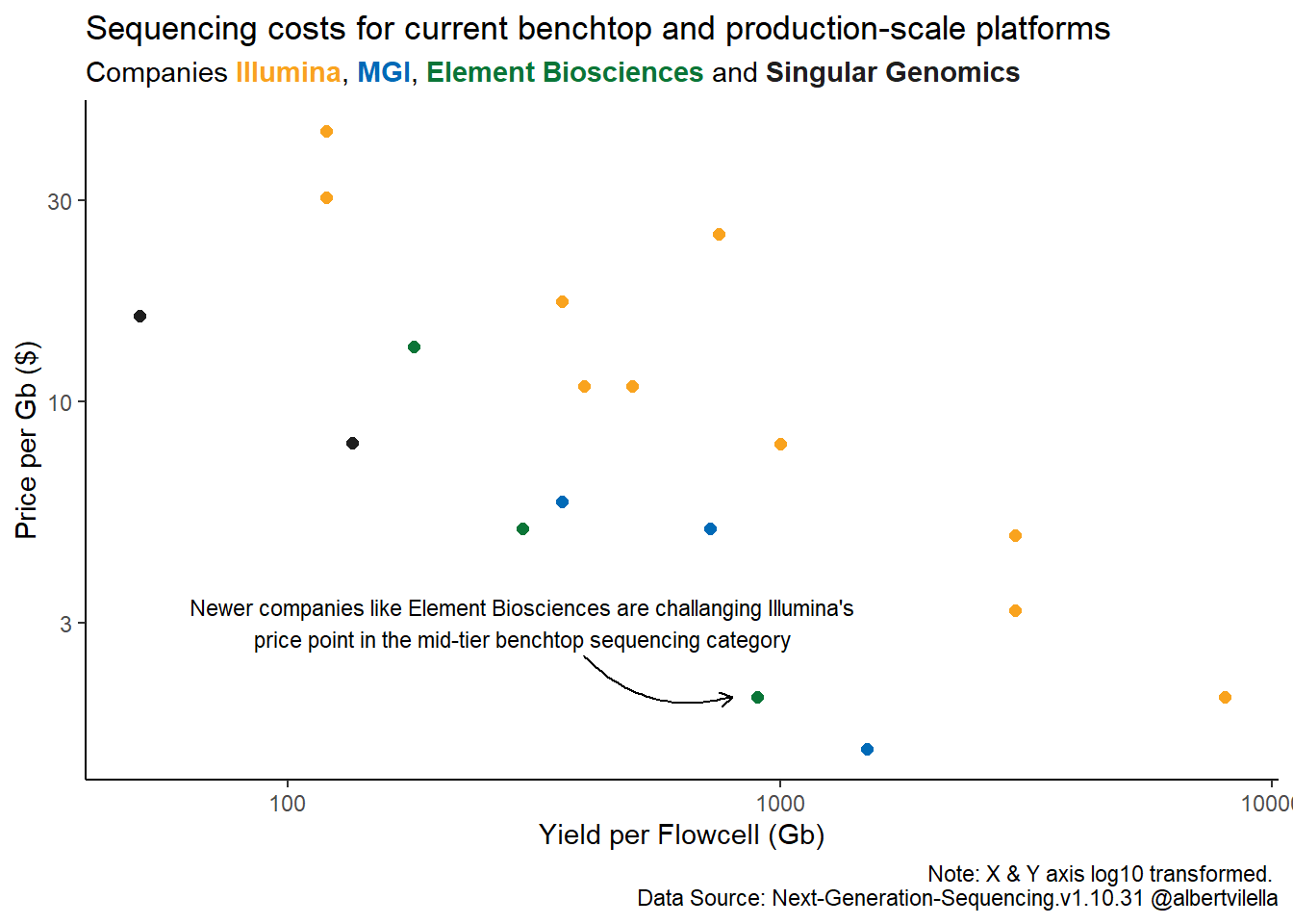
Here is the full code 👇 showing how to use the annotate function, enjoy!
library(ggplot2)
library(ggtext)

ngs_data <- tibble::tribble(
                                   ~Platform, ~Yield, ~Price_per_Gb,            ~Company, ~Flowcells, ~Yield_per_flowcell,
                   "ILMN NextSeq 550 1fcell",   120L,          43.8,          "Illumina",         1L,                120L,
                   "ILMN HiSeq 4000 2fcells",  1500L,            25,          "Illumina",         2L,                750L,
            "ILMN NextSeq 1000 P1/P2 1fcell",   120L,         30.61,          "Illumina",         1L,                120L,
               "ILMN NextSeq 2000 P3 1fcell",   360L,          17.3,          "Illumina",         1L,                360L,
                   "ILMN NovaSeq SP 2fcells",   800L,          10.9,          "Illumina",         2L,                400L,
                   "ILMN NovaSeq S1 2fcells",  1000L,          10.9,          "Illumina",         2L,                500L,
                   "ILMN NovaSeq S2 2fcells",  2000L,          7.97,          "Illumina",         2L,               1000L,
              "ILMN NovaSeq S4 v1.5 2fcells",  6000L,          4.84,          "Illumina",         2L,               3000L,
  "ILMN NovaSeq X & X Plus 1.5B 10B 2fcells",  6000L,           3.2,          "Illumina",         2L,               3000L,
                "ILMN NovaSeq X 25B 1fcells",  8000L,             2,          "Illumina",         1L,               8000L,
     "ElemBio AVITI 2fcell x3 pricing model",  1800L,             2,        "ElementBio",         2L,                900L,
     "ElemBio AVITI 2fcell 2x150 Cloudbreak",   600L,             5,        "ElementBio",         2L,                300L,
     "ElemBio AVITI 2fcell 2x300 Cloudbreak",   360L,   13.55555556,        "ElementBio",         2L,                180L,
   "Singular Genomics G4 F2 4fcell Standard",   200L,            16, "Singular Genomics",         4L,                 50L,
   "Singular Genomics G4 F2 4fcell Max Read",   200L,            16, "Singular Genomics",         4L,                 50L,
            "Singular Genomics G4 F3 4fcell",   540L,             8, "Singular Genomics",         4L,                135L,
                     "MGI DNBSEQ-T7 4fcells",  6000L,           1.5,               "MGI",         4L,               1500L,
         "MGI DNBSEQ-G400C  CoolMPS 2fcells",  1440L,             5,               "MGI",         2L,                720L,
         "MGI DNBSEQ-G400RS  HotMPS 2fcells",   720L,           5.8,               "MGI",         2L,                360L
  )

ggplot(data = ngs_data, aes(x=Yield_per_flowcell, y=Price_per_Gb, colour=Company, fill=Company)) +
  geom_point(size=2) +
  scale_y_continuous(trans = "log10") +
  scale_x_continuous(trans = "log10") +
  scale_color_manual(values = c("Illumina" = "#FFB542",
                                "MGI" ="#006AB7",
                                "ElementBio" = "#12B460",
                                "Singular Genomics" = "#1E1E1E")) +
  theme_classic() +
  ylab("Price per Gb ($)") +
  xlab("Yield per Flowcell (Gb)") +
  annotate(geom = "curve",
           x = 400, y = 2.5,
           xend = 800, yend = 2,
           curvature = .3,
           arrow = arrow(length = unit(2, "mm"))) +
  annotate(geom = "text", x = 300, y = 3, label = paste(strwrap("Newer companies like Element Biosciences are challanging Illumina's price point in the mid-tier benchtop sequencing category", width = 70), collapse = "\n"), hjust = "centre", size=3) +
  labs(title = "Sequencing costs for current benchtop and production-scale platforms",
       subtitle = "Companies
       <span style='color:#FFB542;'>**Illumina**</span>,
       <span style='color:#006AB7;'>**MGI**</span>,
       <span style='color:#12B460;'>**Element Biosciences**</span> and
       <span style='color:#1E1E1E;'>**Singular Genomics**</span>",
       caption = "Note: X & Y axis log10 transformed. \n Data Source: Next-Generation-Sequencing.v1.10.31 @albertvilella") +
  theme(panel.grid = element_blank(),
        plot.subtitle = element_markdown(),
        legend.position = "none")
Order a boxplot for improved across axis comparisions
If you are using a boxplot to demonstrate differences across multiple groups you may encounter the problem whereby the standard order of groups results in a saw tough pattern which can make it difficult to compare across groups 😕👇
When creating a boxplot to showcase differences and variations among multiple groups, you might run into an issue where the default order of groups creates a jagged pattern 👇 This can really complicate the comparison process across these groups 😕

To enhance the clarity of your visual representation and make comparisons easier, you should consider reordering the groups in a more intuitive or meaningful sequence. This can help in presenting the data in a way that is more easily understandable and conducive to drawing accurate conclusions.
To reorder x from low to high based on y-values use the reorder function within the ggplot mappings.
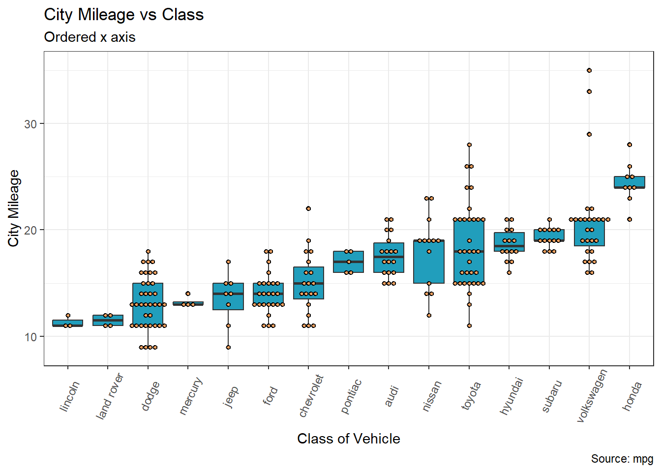
Here is the full code 👇 showing how to use the reorder function, enjoy!
library(tidyverse)
ggplot(mpg, aes(x = reorder(manufacturer, cty, na.rm = TRUE), y = cty)) +
  geom_boxplot(fill = "#219ebc") +
  geom_dotplot(binaxis='y',
               stackdir='center',
               dotsize=0.5,
               fill = "#f4a261") +
  theme(axis.text.x = element_text(angle=65, vjust=0.6)) +
  labs(title="City Mileage vs Class",
       subtitle="Ordered x axis",
       caption="Source: mpg",
       x="Class of Vehicle",
       y="City Mileage")
Labelling Legends
Legend titles and value labels in visual representations by default often lack clarity and may appear disorganized. This happens as they’re directly derived from data and column headings, typically designed to be concise and format-free in programming. Consequently, they might seem puzzling or cluttered. Consider the plot below: if you’re acquainted with the mpg dataset, you’d recognise drv as denoting drive train type—where 4 stands for 4-wheel drive, f for front-wheel drive, and r for rear-wheel drive, while cyl indicates the number of cylinders.
However, if you do not know of the mpg dataset, which lets be honest is the likely scenario of your target audience, then you might just leave them as puzzled as a possum 😕
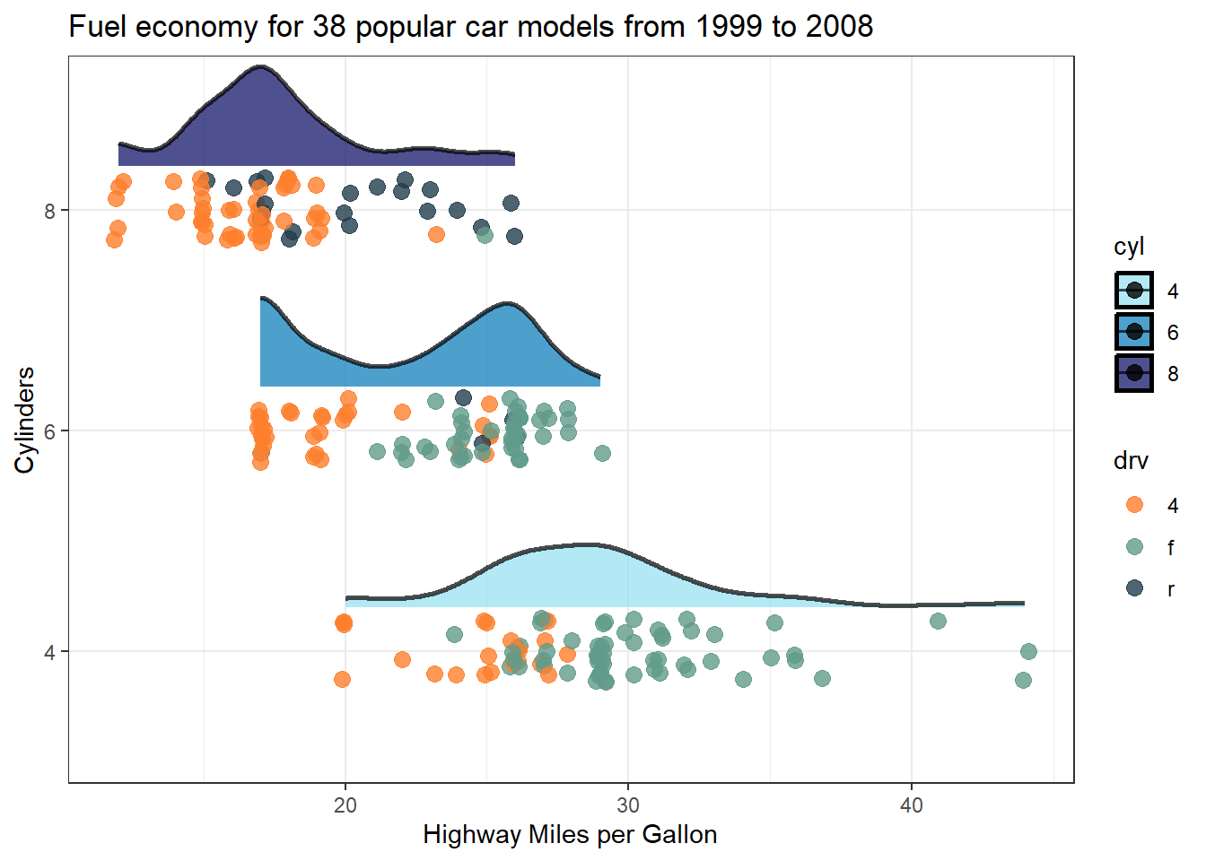
However correcting this in your plots is dead simple. Just add label and name (title) details to the scale_colour_* and scale_fill_* functions as demonstrated below 👇
ggplot(data = mpg |>
         filter(cyl != 5) |>
         mutate(cyl = as.factor(cyl)),
       aes(x = hwy, y = cyl, fill = cyl)) +
  stat_halfeye(
    point_color = NA, .width = 0, height = 0.5,
    position = position_nudge(y = 0.2),
    alpha = 0.7,
    slab_colour = "black"
  ) +
  geom_point(position = position_jitter(width = 0.2, height = 0.15, seed = 1),
             alpha = 0.7,
             size = 3,
             aes(colour = drv)) +
  scale_colour_manual(values = c("#fe7f2d", "#619b8a", "#233d4d"),
1                      labels = c("4 wheel drive",
                                 "Front wheel drive",
                                 "Rear wheel drive"),
2                      name = "Drive Train") +
  scale_fill_manual(values = c("#90e0ef", "#0077b6", "#03045e"),
3                    name = "Cylinders") +
  theme_bw() +
  ylab("Cylinders") +
  xlab("Highway Miles per Gallon") +
ggtitle("Fuel economy for 38 popular car models from 1999 to 2008")- 1
- Add new labels to the three point data categories
- 2
- Add a name/title to the point data legend
- 3
- Add a name/title to the distribution data legend
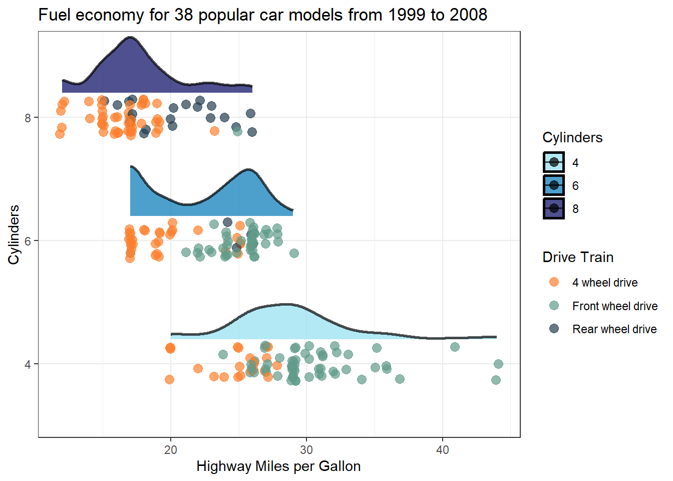
Be a champion and help out your audience 👍
Extracting array indexes of the maximum value
Quick one here, you might have become accustomed to the ability to return array indexes (row & col numbers) within the which() function by adding the arr.ind = T parameter. Turns out though this isn’t available in the which.max() function. I will leave you to ponder the ‘why’ background behind that…🤔
Simple solution, all you need to do is pass the index value returned from which.max() to the arrayInd() function. See below, with and without pipes depending on your style 👇
mat <- matrix(rnorm(400), nrow = 20)

# With pipes
mat |> (\(.)arrayInd(which.max(.), .dim = dim(.)))()

# Without pipes
arrayInd(which.max(mat), .dim = dim(mat))
Happy days 🍹
Reversing continous colour gradients
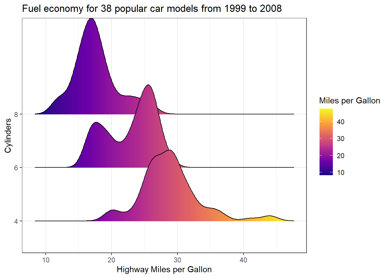
Ever thought that colour scale 👆 in your ggplot would look better reversed 🤔 Well its super simple 👇
ggplot(data = mpg |>
         filter(cyl != 5) |>
         mutate(cyl = as.factor(cyl)),
       aes(x = hwy, y = cyl, fill = stat(x))) +
  geom_density_ridges_gradient() +
1  scale_fill_viridis_c(name = "Miles per Gallon", option = "C", trans = "reverse") +
  theme_bw() +
  xlab("Highway Miles per Gallon") +
  ylab("Cylinders") +
ggtitle("Fuel economy for 38 popular car models from 1999 to 2008")- 1
-
Add
trans = "reverse"
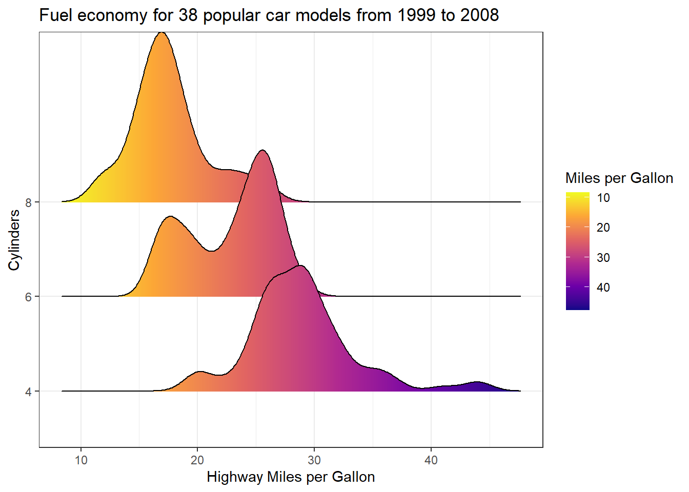
…🚨 well maybe not the right plot to reverse the colour scale on, but you get the point.
Reference a column name with a variable in dplyr
Its not uncommon to need to reference a column name in a data frame using a variable. You might have found that you can do this in the some dplyr functions, such as select(), by surrounding it in double braces { var }. However this doesn’t play out for other functions such as filter()
There a few different methods I have collated (thanks to the awesome rstats mastodon community) that seem to work well ✅
library(dplyr)
data(mtcars)

#filter mtcars for entries with 4 cyclinders

var_name <- "cyl"

#option 1: sym
mtcars |> filter(!!sym(var_name) == 4)

#option 2: as.symbol
mtcars |> filter(!!as.symbol(var_name) == 4)

#option 3: .data[[]]
mtcars |> filter(.data[[var_name]] == 4)]

#option 4: get()
mtcars |> filter(get(var_name) == 4)

#option 5: eval(parse())
mtcars |> filter(eval(parse(text = var_name)) == 4)
Now, I’m not sure which method is technically the ‘proper method’, and like most things in R there is usually multiple correct ways to do the same thing. A couple of notes though 📝 Option 1 uses sym() from dplyr which according to the documentation is ‘no longer for normal usage, but are still exported from dplyr for backward compatibility’. Option 2 uses as.symbol() which is from base R so that is a safe bet. Option 3 appears to be what is indicated in some of the tidyverse documentation. Option 5: seems a bit drawn out. Final comment, choose your own path champions 👍
Leveraging additional factors in column names when pivoting longer
When dealing with extensive datasets featuring multiple measurements, there’s often valuable supplementary information embedded within column names. This additional data, such as intervals ⌛or measurement types 📏, can significantly enrich your analysis. Fortunately, leveraging this information when pivoting longer is straightforward, particularly if your column names adhere to a consistent structure.
By employing a consistent field separator in your column names, you can seamlessly extract secondary factors during the pivot process. The pivot_longer function, equipped with the names_sep parameter, enables you to split the data efficiently into meaningful segments using names_to.
Check out this example 👇
library(tidyr)
library(ggplot2)


# Sample wide data with interval and measurement type info stored within column names
data_tbl <- tibble(sample = c("ST001", "ST002", "ST003"),
                   day1_weight = c(10, 12, 7),
                   day1_count = c(2, 3, 2),
                   day5_weight = c(14, 20, 15),
                   day5_count = c(4, 7, 5),
                   day9_weight = c(18, 23, 19),
                   day9_count = c(8, 8, 7))

# Pivot longer, capturing the day interval as an additional factor along with measurement type
data_long <- pivot_longer(data_tbl, col = !sample,
                          names_to = c("day", "measurement"),
                          names_sep = "_",
                          values_to = "value")

ggplot(data = data_long,
       aes(x = day, y = value, fill = sample)) +
  geom_bar(stat = "identity", position = "dodge") +
  scale_fill_manual(values = c("#219ebc", "#023047", "#ffb703"), name = "Sample") +
  theme_bw() +
  theme(legend.position = "top") +
  facet_wrap(~measurement)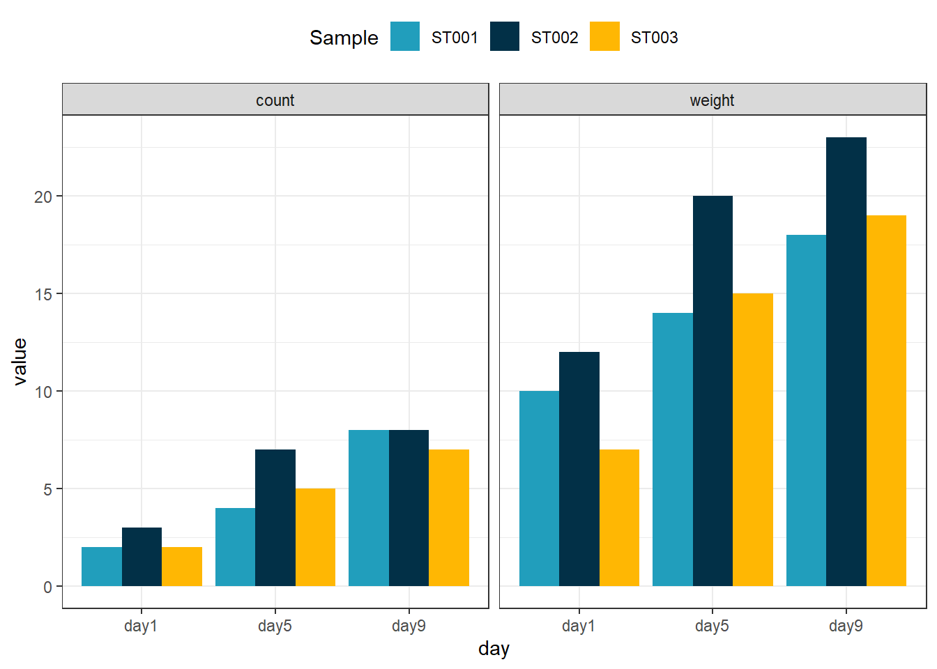
Saving high quality figures the easy way
There was a time where I would export my R plots as pdfs and then convert them to .tiff .png or .jpeg with GIMP to get achieve that high quality finish 🖼️ That was until I came across camcorder. camcorder simplifies the whole process of exporting and saving R plots and they come out looking fantastic 👌
library(tidyverse)
library(ggdist)
library(ggplot2)
library(camcorder)

#Start recording plot images
gg_record(
  dir = "plot_images", # where to save the recording
  device = "png", # device to use to save images
  width = 8,      # width of saved image
  height = 6,     # height of saved image
  units = "in",   # units for width and height
  dpi = 300       # dpi to use when saving image
)

ggplot(data = mpg |>
         filter(cyl != 5) |>
         mutate(cyl = as.factor(cyl)),
       aes(x = hwy, y = cyl, fill = cyl)) +
  stat_halfeye(
    point_color = NA, .width = 0, height = 0.5,
    position = position_nudge(y = 0.2),
    alpha = 0.7,
    slab_colour = "black"
  ) +
  geom_point(position = position_jitter(width = 0.2, height = 0.15, seed = 1),
             alpha = 0.8,
             size = 3,
             aes(colour = drv)) +
  scale_colour_manual(values = c("#fe7f2d", "#619b8a", "#233d4d")) +
  scale_fill_manual(values = c("#90e0ef", "#0077b6", "#03045e")) +
  theme_bw() +
  ylab("Cylinders") +
  xlab("Highway Miles per Gallon") +
  ggtitle("Fuel economy for 38 popular car models from 1999 to 2008")

gg_stop_recording() #stop exporting every plot
Which exports a .png that looks like 👇 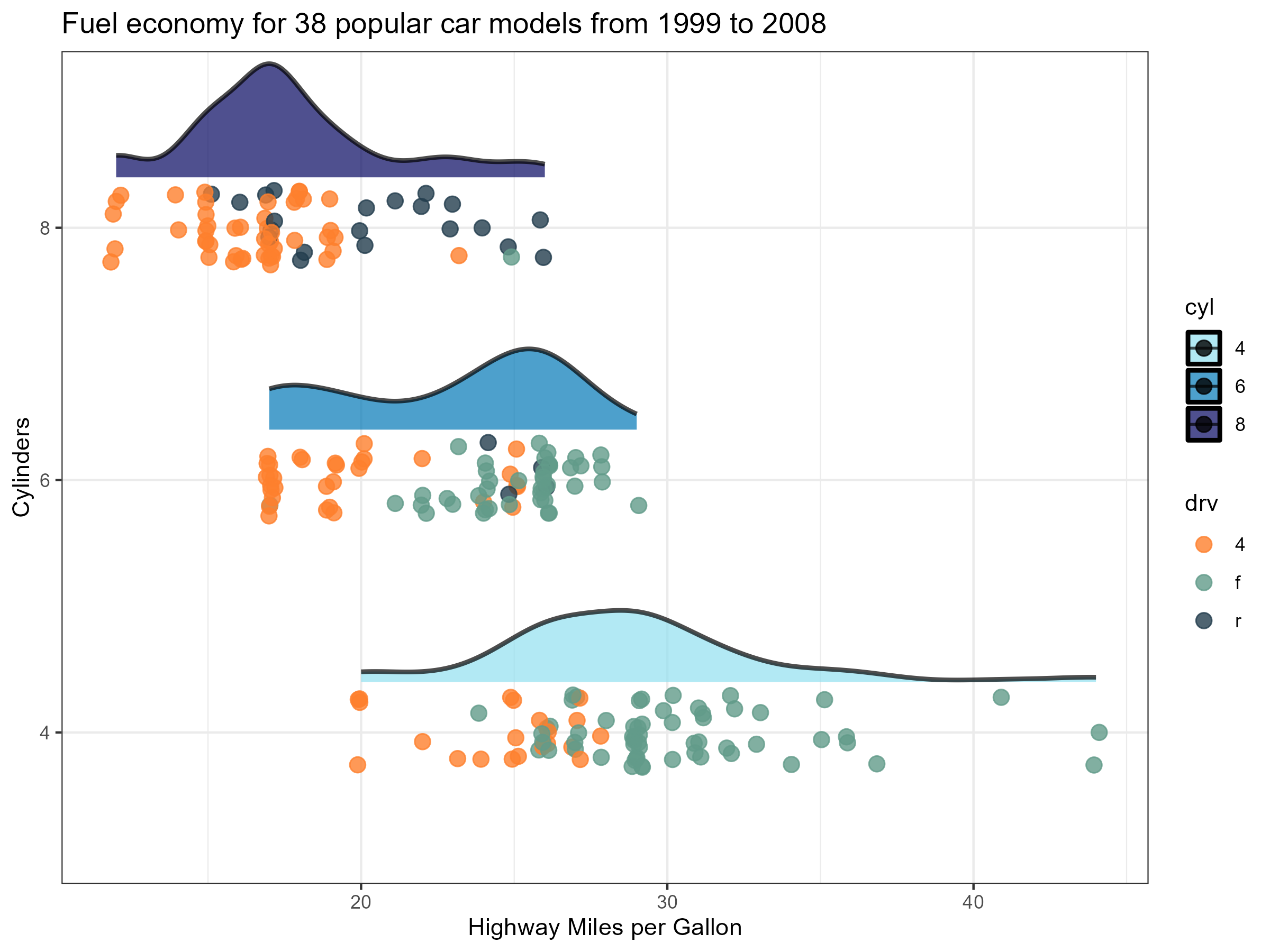
Simulated multiple correlated normal distributions
Ever needed to generate multiple vectors with a complex set of correlations. This is R so of course there is a package for that. Queue faux and the rnorm_multi() function. With this function you can define the number of values, means and standard deviation of each vector of variables generated, and of course the correlation among the variables. Check out the example below 👇
library(faux)
library(GGally)

set.seed(404)
mnorm_ndata <- rnorm_multi(n = 100,
                         vars = 3,
                         mu = 0,
                         sd = 1,
                         r = c(1, 0.6, -0.2,
                               0.6, 1, 0.6,
                               -0.2, 0.6, 1))

cor(mnorm_ndata)
X1 X2 X3
X1 1.0000000 0.5915397 -0.1862559
X2 0.5915397 1.0000000 0.6148656
X3 -0.1862559 0.6148656 1.0000000cor_ndata <- cor(mnorm_ndata)
ggpairs(mnorm_ndata)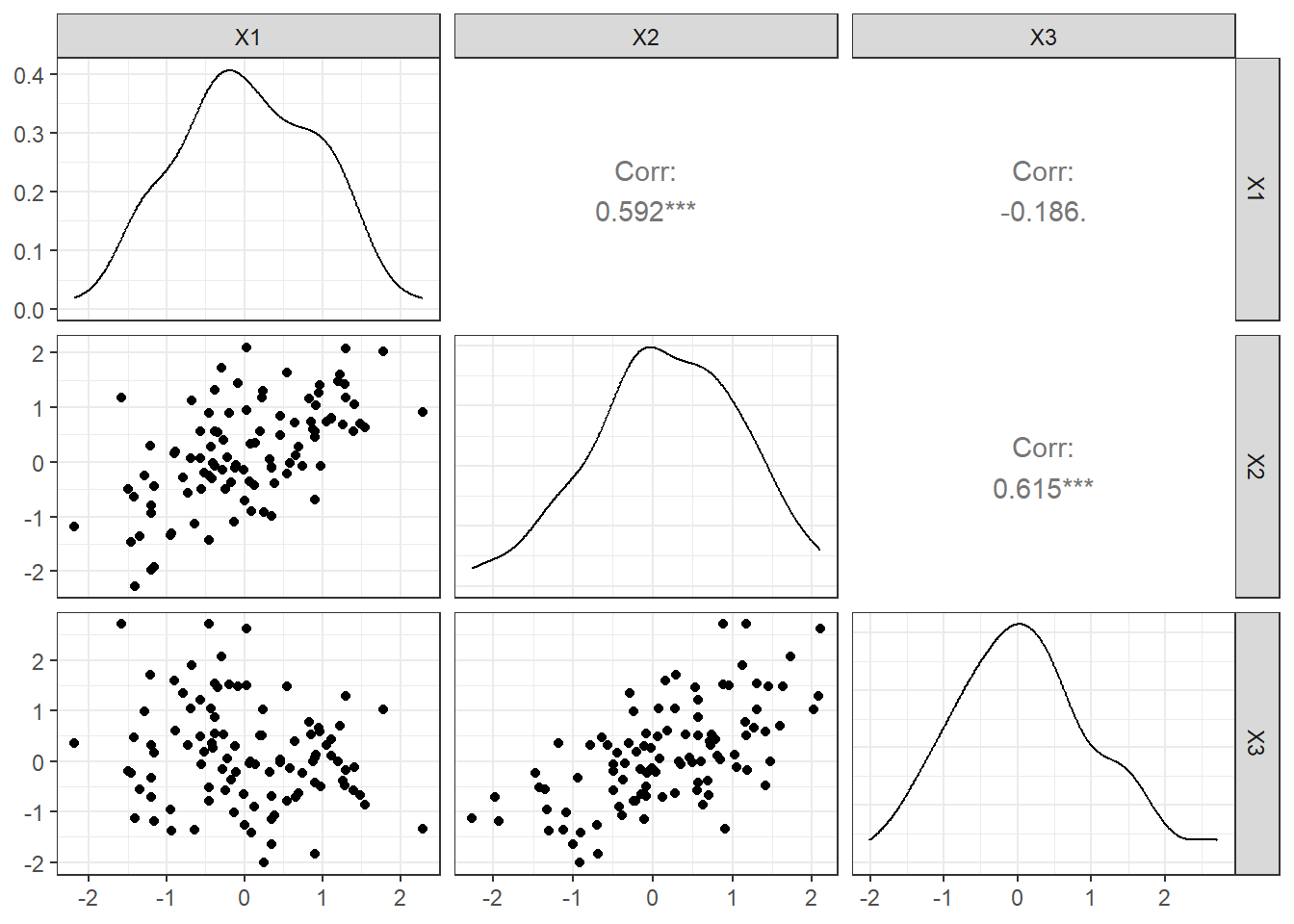
Highlight specific datapoints by adding shapes around them
Sometimes you might want to direct your audience to specific datapoints in our plots. You could do this by adding an annotation arrow and text as described in an earlier ramblings, however if it is a cohort a data this might not be suitable. Instead a better approach might be to circle the relevant datapoints with shapes like circles ⭕ You can achieve in ggplot by essentially adding additional points with geom_point() but on a filtered subset of the data. Here is an example 👇
data(mtcars)

ggplot(data = mtcars,
       aes(x = disp, y = mpg, colour = as.factor(cyl))) +
  geom_point() +
  scale_color_manual(values = c("#FF8C00","#9932CC","#008B8B"),
                     name = "Cylinders") +
  geom_point(data = mtcars |> filter(hp < 80),
             pch = 21,
             size = 4,
             colour = "black") +
  theme_bw() +
  labs(title = "Relationship between car displacement and miles per gallon",
       subtitle = "Vehicles with less than 80 gross horse power circled")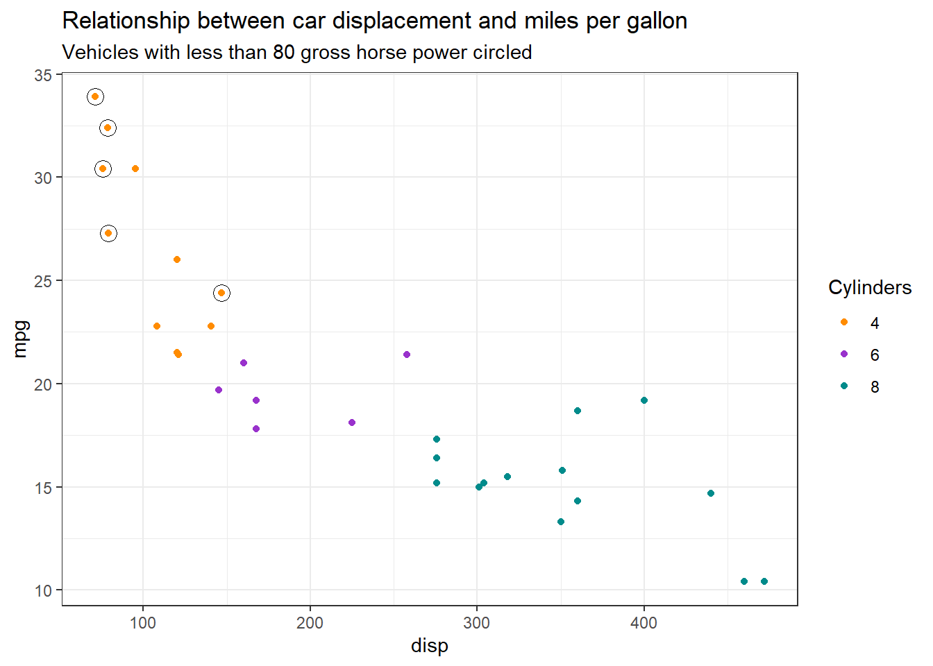
Adding point annotations to density plots
Have you ever had a density plot and wanted to annotate to your audience where specific data points sit along that density function? It might not seem immediately straightforward to do, but if you take a step back, you already have the x-axis values to place your annotation, all you need to determine what the corresponding y-axis value is and then use the ggrepel package to add text labels. You can pull y-axis values out from the density() function however you will need to do a little trickery to find the closest matching x-axis value from the density function to match to your data.
Let’s take a closer look. Using the precip dataset containing ‘Annual Precipitation in US Cities’. If you plot it as density function, you get 👇
library(dplyr)
library(purrr)
library(tibble)
library(ggplot2)
library(ggrepel)

data(precip)

precip_tbl <- tibble(city = names(precip), precipitation = precip)

ggplot(data = precip_tbl, aes(x = precipitation)) +
  geom_density(colour = "#023047", fill = "#8ecae6") +
  ylab("Density") +
  xlab("Precipitation") +
  ggtitle("Annual Precipitation in US Cities") +
  theme_classic()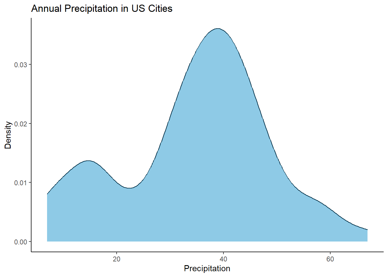
Now you can get x and y values for this density distribution by just using the density() function. Here it is 👇
data(precip)

precip_tbl <- tibble(city = names(precip), precipitation = precip)

tibble(x = density(precip_tbl$precipitation)$x, y = density(precip_tbl$precipitation)$y)
# A tibble: 512 × 2
x y
<dbl> <dbl>
1 -4.54 0.0000483
2 -4.38 0.0000550
3 -4.22 0.0000626
4 -4.06 0.0000710
5 -3.89 0.0000803
6 -3.73 0.0000910
7 -3.57 0.000103
8 -3.41 0.000116
9 -3.24 0.000130
10 -3.08 0.000146
# ℹ 502 more rowsHowever, the x values will not directly match up to the x values in your original data (i.e. the precipitation data points for each city). So what we need to do is find the closest match. The simplest way (that I know of) is to subtract the density x values away from the city precipitation data points, convert them to an absolute value and find the smallest number (i.e. the smallest difference, the closest match). For example for the city of Chicago let’s find the y value 👇
library(dplyr)
library(purrr)
library(tibble)
library(ggplot2)
library(ggrepel)

data(precip)

precip_tbl <- tibble(city = names(precip), precipitation = precip)

# Chicago precipitation
precip_tbl$precipitation[precip_tbl$city == "Chicago"]
Chicago
34.4 # Find the closest match
idx <- which.min(abs(precip_tbl$precipitation[precip_tbl$city == "Chicago"] - density(precip_tbl$precipitation)$x))
# What is the y value
density(precip_tbl$precipitation)$y[idx][1] 0.03153999So how does this match up on the density plot. Chicago’s precipitation was 34.4, the derived y value of 0.03156667 looks pretty good 👍

Ok, thats the background workings looking good, now lets wrap it up in some more concise code and label all cities 👇
library(dplyr)
library(purrr)
library(tibble)
library(ggplot2)
library(ggrepel)

data(precip)

precip_tbl <- tibble(city = names(precip), precipitation = precip)
precip_tbl <- precip_tbl |> mutate(yval = map_dbl(precipitation, function (x) {
  density(precip_tbl$precipitation)$y[which.min(abs(x - density(precip_tbl$precipitation)$x))]
  }))

# Label all cities
ggplot(data = precip_tbl, aes(x = precipitation)) +
  geom_density(colour = "#023047", fill = "#8ecae6") +
  geom_text_repel(mapping=aes(x = precipitation, y = yval, label = city), size=3, max.overlaps = 30) +
  ylab("Density") +
  xlab("Precipitation") +
  ggtitle("Annual Precipitation in US Cities") +
  theme_classic()
Want to make it clear where the specific point is, just add geom_point() as well
data(precip)

precip_tbl <- tibble(city = names(precip), precipitation = precip)
precip_tbl <- precip_tbl |> mutate(yval = map_dbl(precipitation, function (x) {
  density(precip_tbl$precipitation)$y[which.min(abs(x - density(precip_tbl$precipitation)$x))]
  }))

# Label all cities
ggplot(data = precip_tbl, aes(x = precipitation)) +
  geom_density(colour = "#023047", fill = "#8ecae6") +
  geom_point(mapping = aes(x = precipitation, y = yval), colour = "red") +
  geom_text_repel(mapping = aes(x = precipitation, y = yval, label = city), size = 3, max.overlaps = Inf) +
  ylab("Density") +
  xlab("Precipitation") +
  ggtitle("Annual Precipitation in US Cities") +
  theme_classic()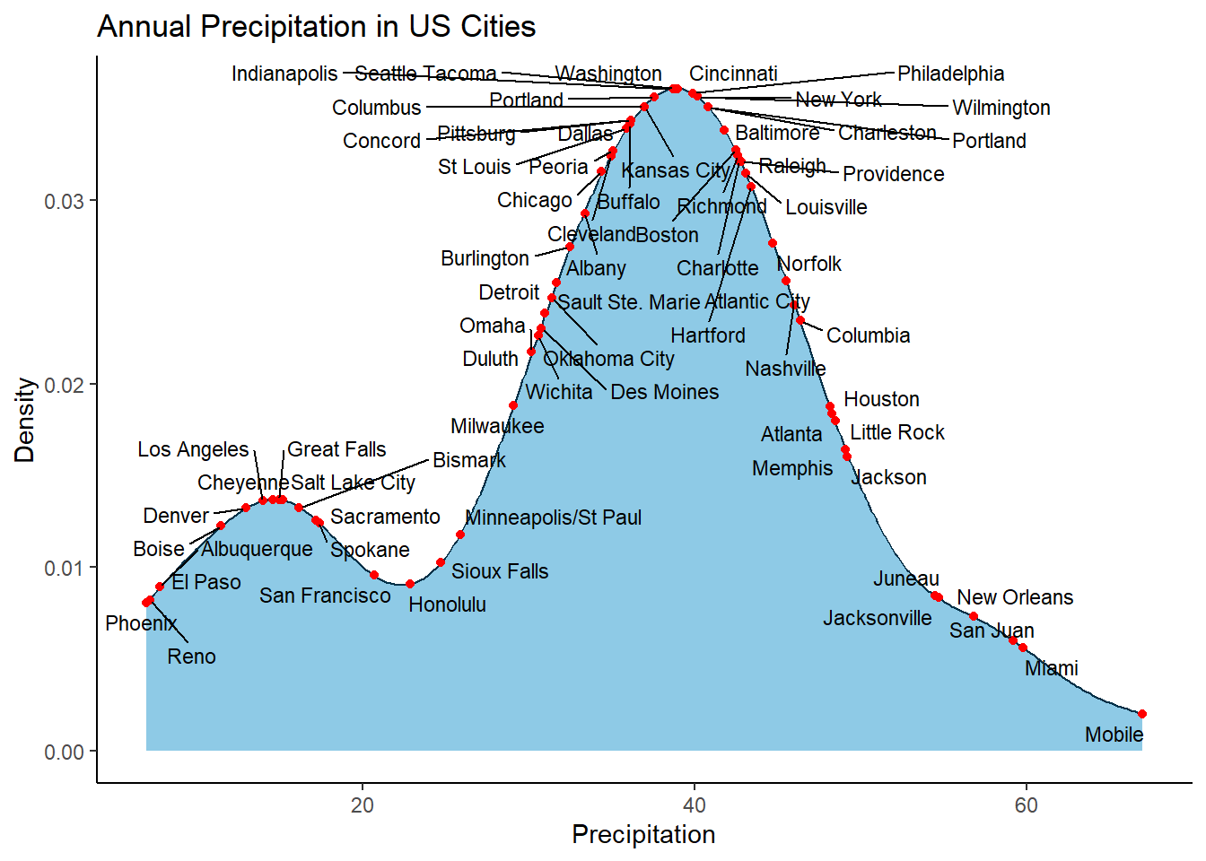
Maybe you don’t want to label all cities and instead want to focus on Chicago and Memphis, just throw in a filter() and you are set👇
# Label only Chicago & Memphis
ggplot(data = precip_tbl, aes(x = precipitation)) +
  geom_density(colour = "#023047",
               fill = "#8ecae6") +
  geom_text_repel(data = precip_tbl |>
                    filter(city %in% c("Chicago", "Memphis")),
                           mapping=aes(x = precipitation,
                                       y = yval,
                                       label = city),
                           size=3, max.overlaps = Inf) +
  ylab("Density") +
  xlab("Precipitation") +
  ggtitle("Annual Precipitation in US Cities") +
  theme_classic()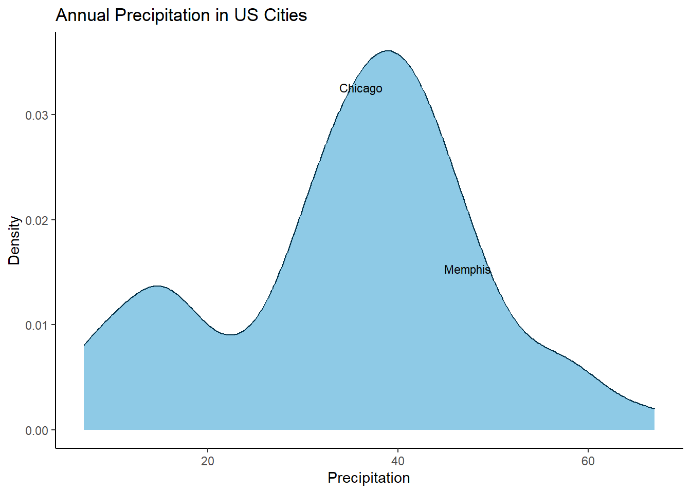
Now maybe there is a different way to achieve this, but this has been the method I have used for a number of years now and it hasn’t failed me. Shoutout if you have suggestions.
Citation
BibTeX citation:
@online{pembleton2026,
  author = {Pembleton, LW},
  title = {R {Ramblings,} {A} Worthy Collection of Short {R} Commands
    and Tricks},
  date = {2026-01-31},
  url = {https://lpembleton.rbind.io/ramblings/R/},
  langid = {en}
}
For attribution, please cite this work as:
Pembleton, LW. 2026. “R Ramblings, A Worthy Collection of Short R
Commands and Tricks.” January 31, 2026. https://lpembleton.rbind.io/ramblings/R/.